1 Interface
In this chapter we introduce the key visualisations, summaries and analysis that we found to be the most important for an athlete to have a sufficient and accurate representation of their training both across and within sessions, as well as to allow an easy comparison and tracking of their evolution in time.
1.1 Workout timeline
The workout timeline plot (Figure 1.1) shows time, date and length of the user’s sessions. It displays segments of each individual session on a plot with time of the day on the x-axis and date on the y-axis and the length of each segment represents the duration of the session. The workout timeline provides an athlete with valuable information on what times of the day they tend to train and for how long. The plot exposes changes in training patterns, such as changes in training times, frequency and duration.
The ability to select sessions from the timeline plot allows the user to analyse, for example, evening sessions and morning sessions separately, as well as the user might be interested in analysing sessions within a specific time range. For example, Figure 1.2 illustrates the user selecting sessions between 16:00-21:00. Hovering over session segments displays the session number, start and end date to provide a more detailed description.
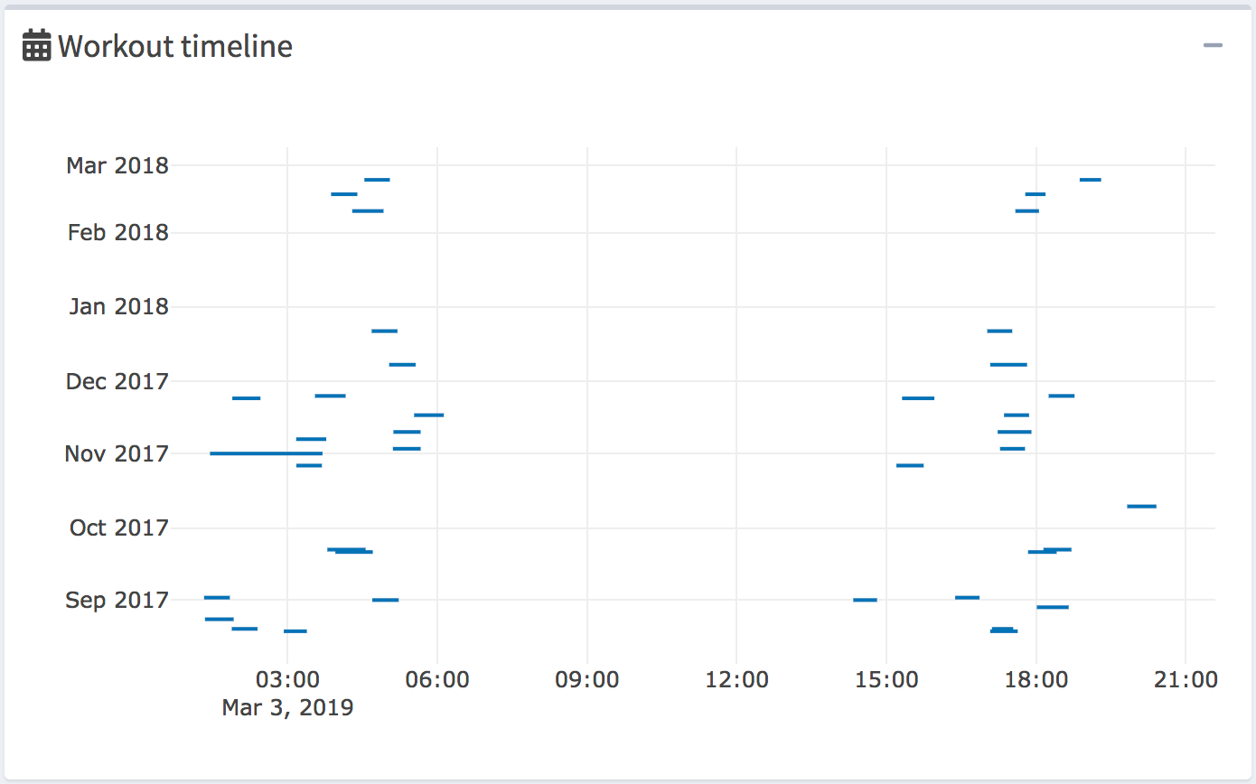
Figure 1.1: Workout timeline
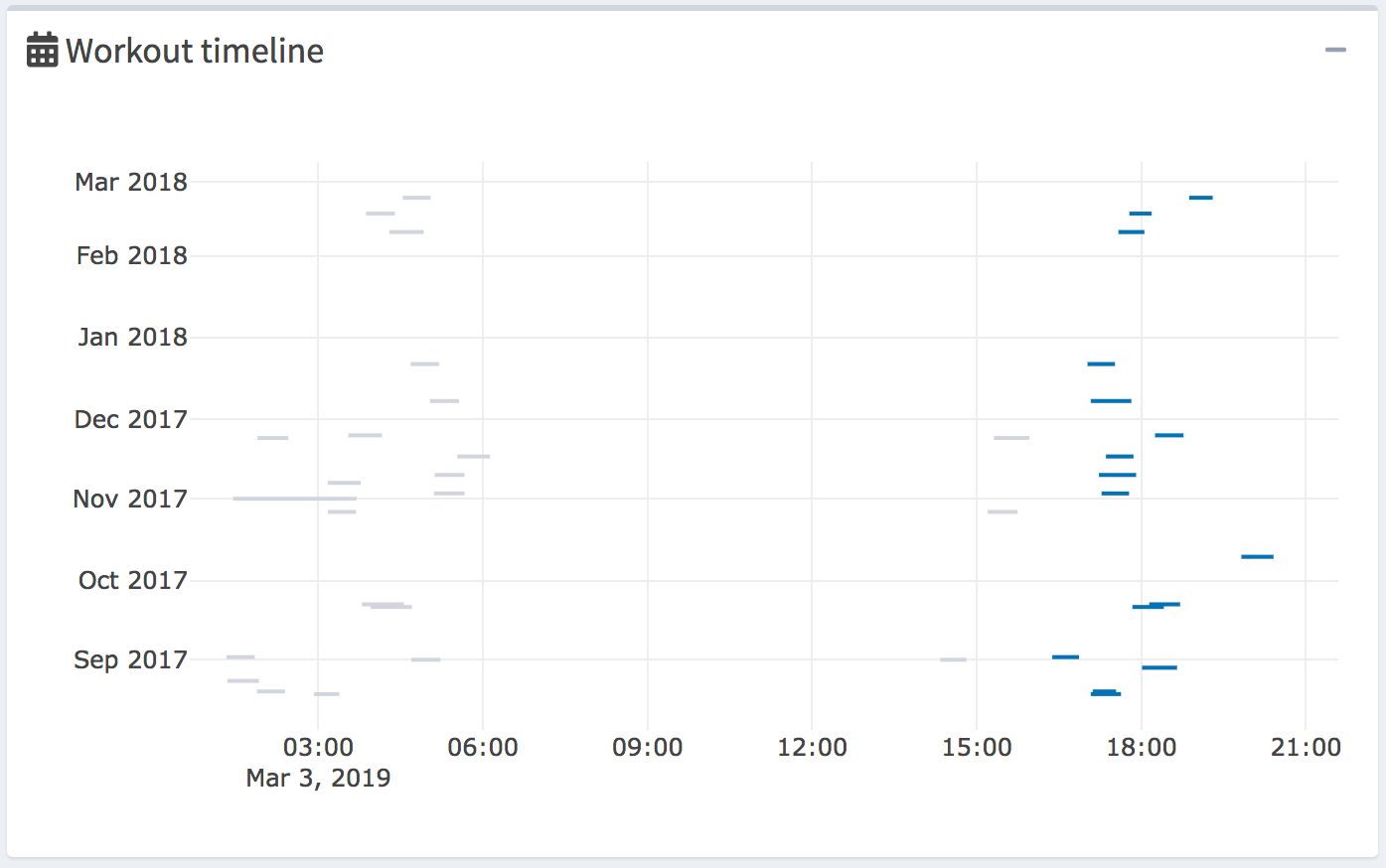
Figure 1.2: Workout Timeline - sessions selected by date and time of the day
1.2 Summary table of selected sessions
The summary table (Figure 1.3) displays the date, the start time, the end time, the duration and the sport of each session, as well as it allows users to select sessions directly from the table. Currently selected sessions are highlighted with a blue colour. In order to accommodate for large datasets, the table is scrollable with the ability to search for key values.
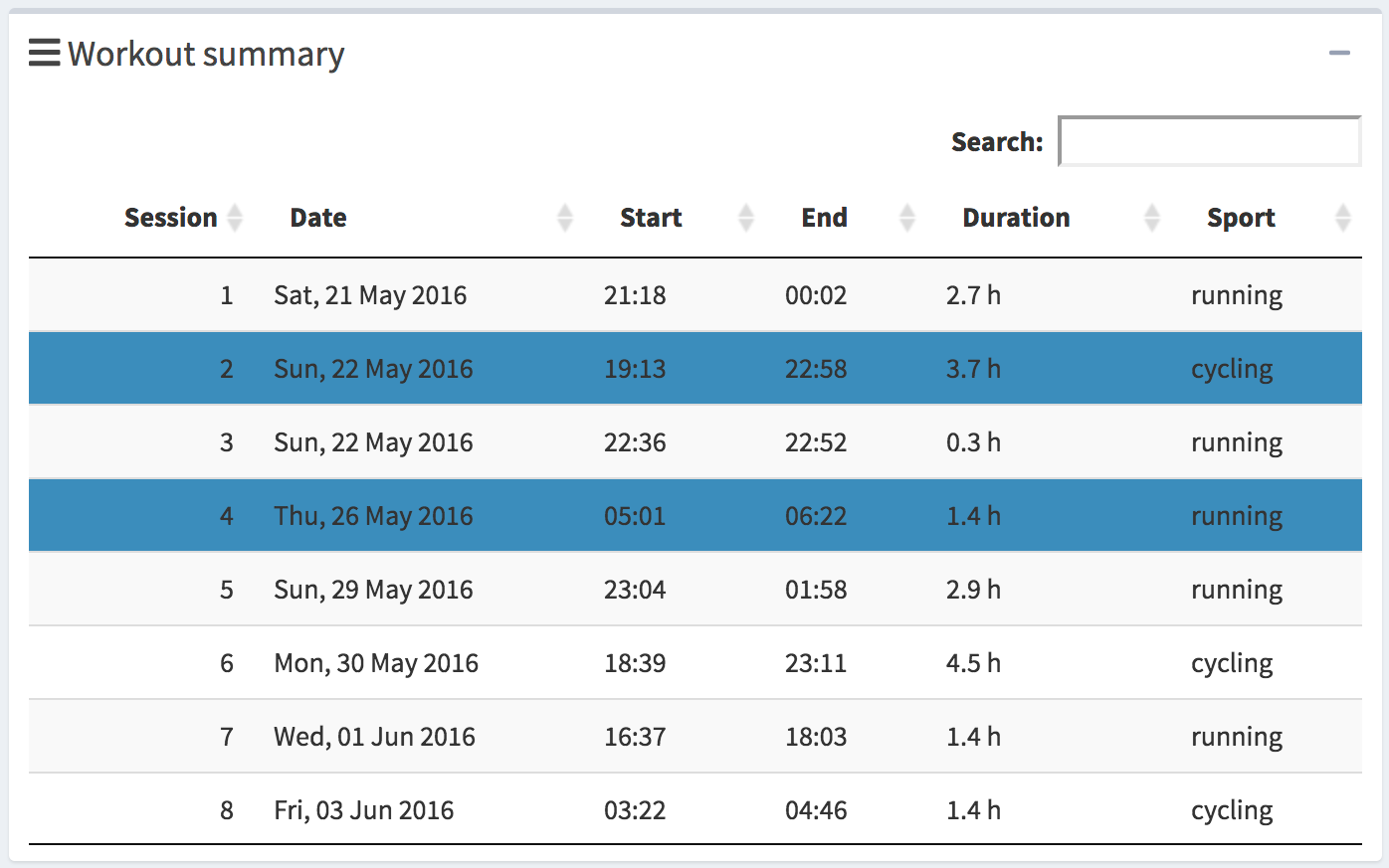
Figure 1.3: Summary of Selected Sessions
1.3 Map
The map (Figure 1.4) displays routes of all the currently selected sessions in a blue colour and all the unselected sessions are displayed in a grey colour colour. Hovering over a route displays a basic summary of the session. The basic summary displays the session number, distance, duration, average pace of the session and also the current speed depending.
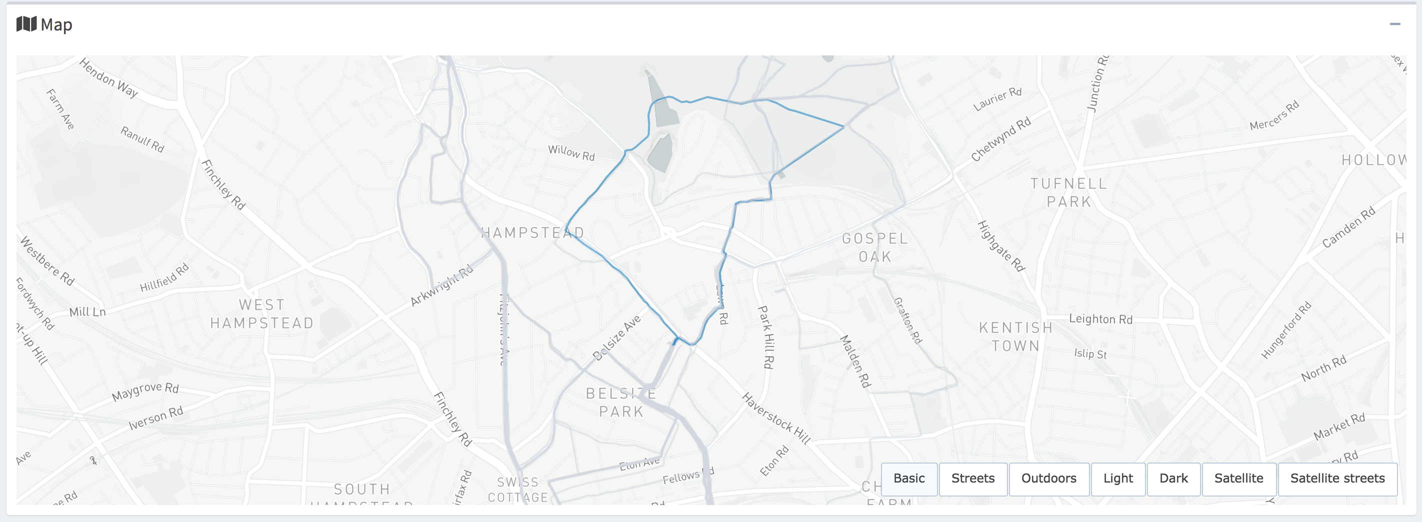
Figure 1.4: Map
1.4 Session summaries plots
The session summary plot in Figure 1.5 displays the scalar summaries of each session on a plot with date on the x-axis and the value on the y-axis. It also shows the current units of measurement on the y-axis. The plot enables the user to track their progress over time, identify changes in their training pattern or detect changes in the intensity of their performance.
Session summary values include: average speed, pace, power, cadence running, cadence cycling, and heart rate, where each variable is calculated over the time spent moving throughout the session. The summaries also include total distance covered, total duration, and work-to-rest ratio. See Frick and Kosmidis (2017) for detail on calculation of each variable and any mathematical formulae.
The trackeRapp implements plots for all the scalar summaries and the user is able to select which variables to plot, where each selected variable is individually plotted in a separate box (Figure 1.5), providing a clear separation in the user interface. As shown in Figure 1.5, selected sessions are highlighted with a blue colour and hovering over an individual point displays the exact value, the date, the number and the sport of the session.
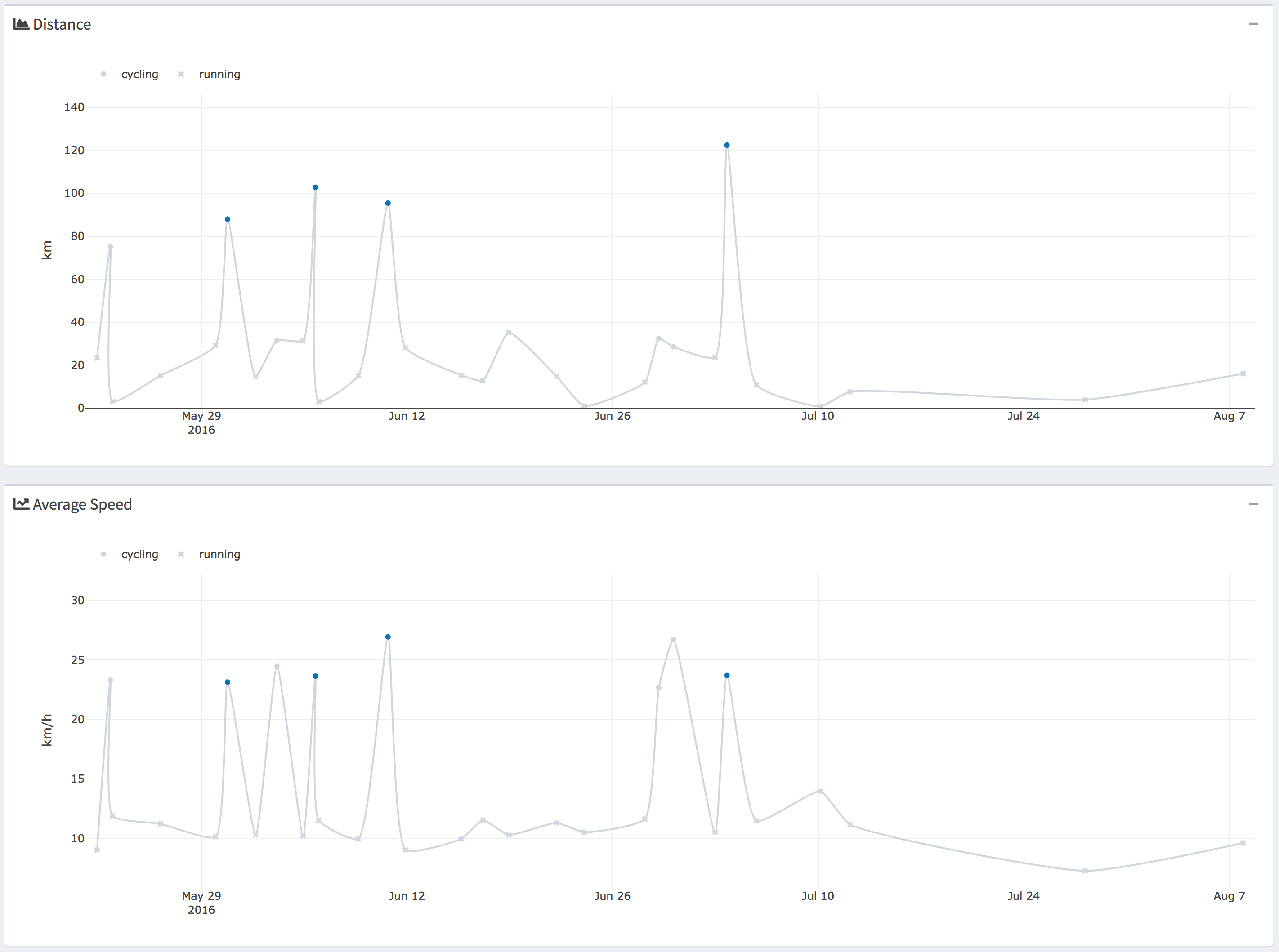
Figure 1.5: Session summary plots for selected variables
1.5 Summary boxes of selected sessions
The summary boxes (Figure 1.6) display the average values for the total distance covered, average duration, average pace and average heart rate for the selected sessions. The boxes provide a tool for an instant analysis and gaining insights of training data in the selected training sessions.

Figure 1.6: Summary boxes
For example, the user might be interested in comparing their training results in the morning and the afternoon, as displayed in Figures 1.7 and 1.8, respectively, by selecting sessions from the workout timeline plot. The user can right away see that the morning and afternoon workouts are quite similar in average distance and duration, but the average pace of 3.2 min/km in the afternoon sessions seems quite considerably lower than for the morning sessions with average pace of 4.6 min/km.
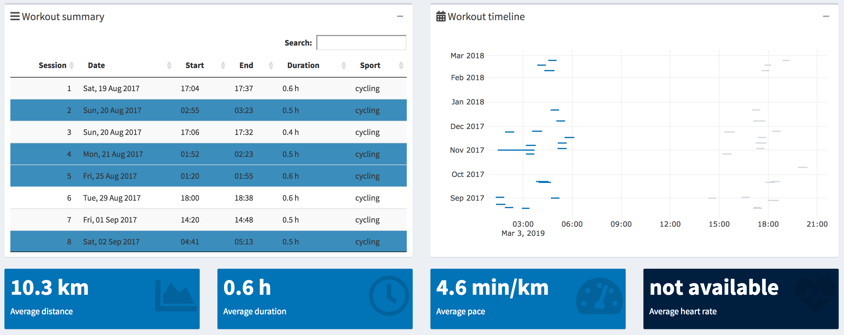
Figure 1.7: Morning workouts
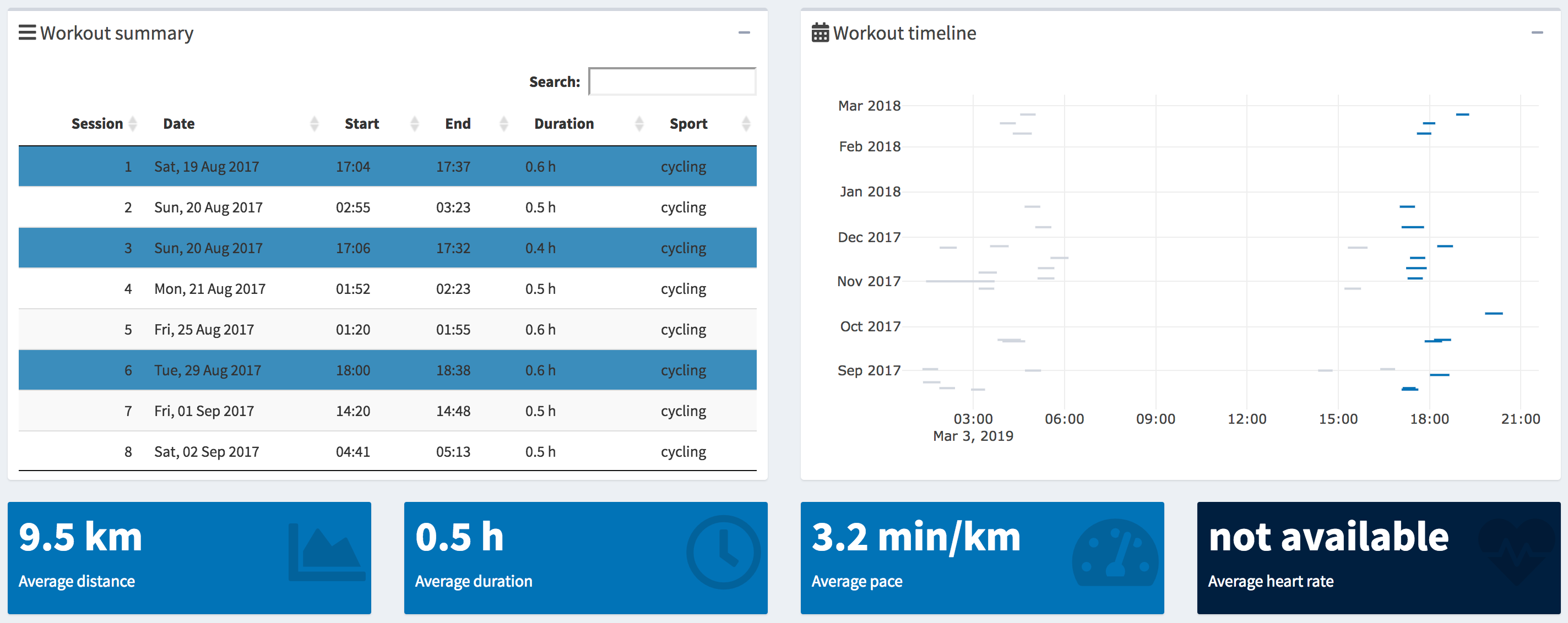
Figure 1.8: Afternoon workouts
1.6 Individual sessions plots
The plots of individual sessions (Figure 1.9) display the changes of a given variable over the course of the selected sessions, with x-axis representing the time and y-axis the value. The following variables can be displayed in the trackeRapp: heart rate, altitude, speed, cadence, power, pace, work-to-rest ratio.
By plotting individual sessions the user is able to obtain a detailed insight into the evolution of a given variable throughout the session. For instance, to gain understanding of fluctuations, consistency or changes in their performance. Selected sessions are plotted side-by-side, share a common y-axis and are scrollable on the x-axis, allowing users to analyse and compare the evolution of a given variable within and between individual sessions. This allows users to, for example, identify patterns between sessions such as detecting consistently high fluctuations in heart rate over the selected sessions.
Each plot has exactly two traces, where the grey colour represents the processed data and the blue line is the data after smoothing.
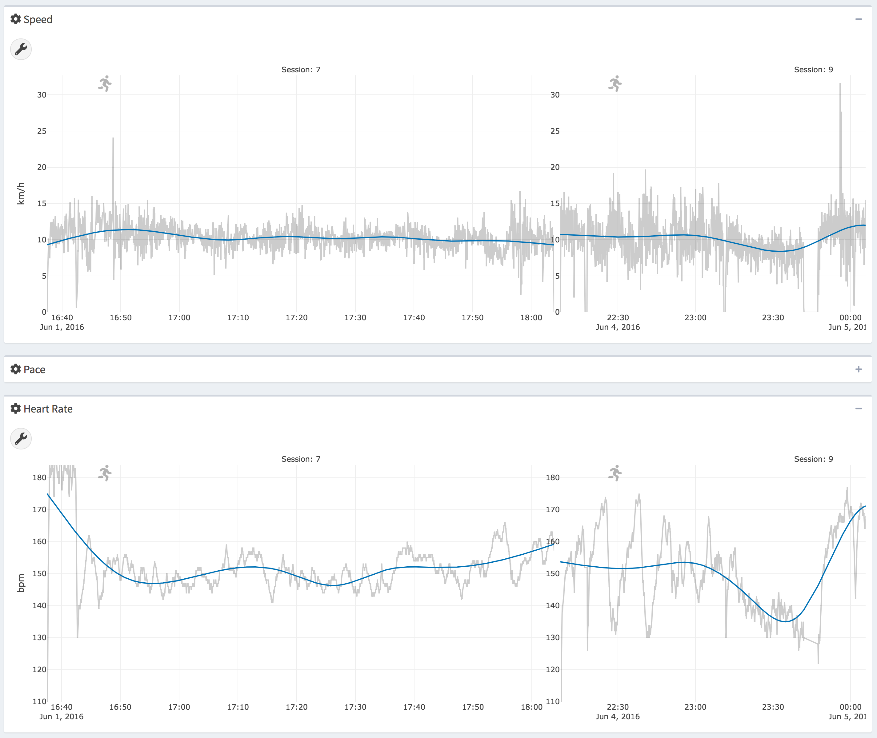
Figure 1.9: Individual session plots
1.7 Time in zones plots
The time in zones plots 1.10 are grouped bar charts coloured by the session number, where x-axis shows the zone categories (e.g., speed zones, heart rate zones) and y-axis represents the percentage of the session spent in the zone. The plots summarize and quantify training intensity distributions by the time spent exercising in certain zones. The user is also able to evaluate their consistency and changes in their performance by comparing the proportion of time spent in different zones. The trackeRapp implements time in zones plots for the following variables: heart rate, speed, pace, altitude, cadence and power. In the trackeRapp the user can specify which variables to plot, as well as how many zones to split the data into. An exact percentage values are displayed by hovering over individual bars.
In Figure 1.10, 21 sessions and the variables speed and heart rate were selected, each split into 5 zones.
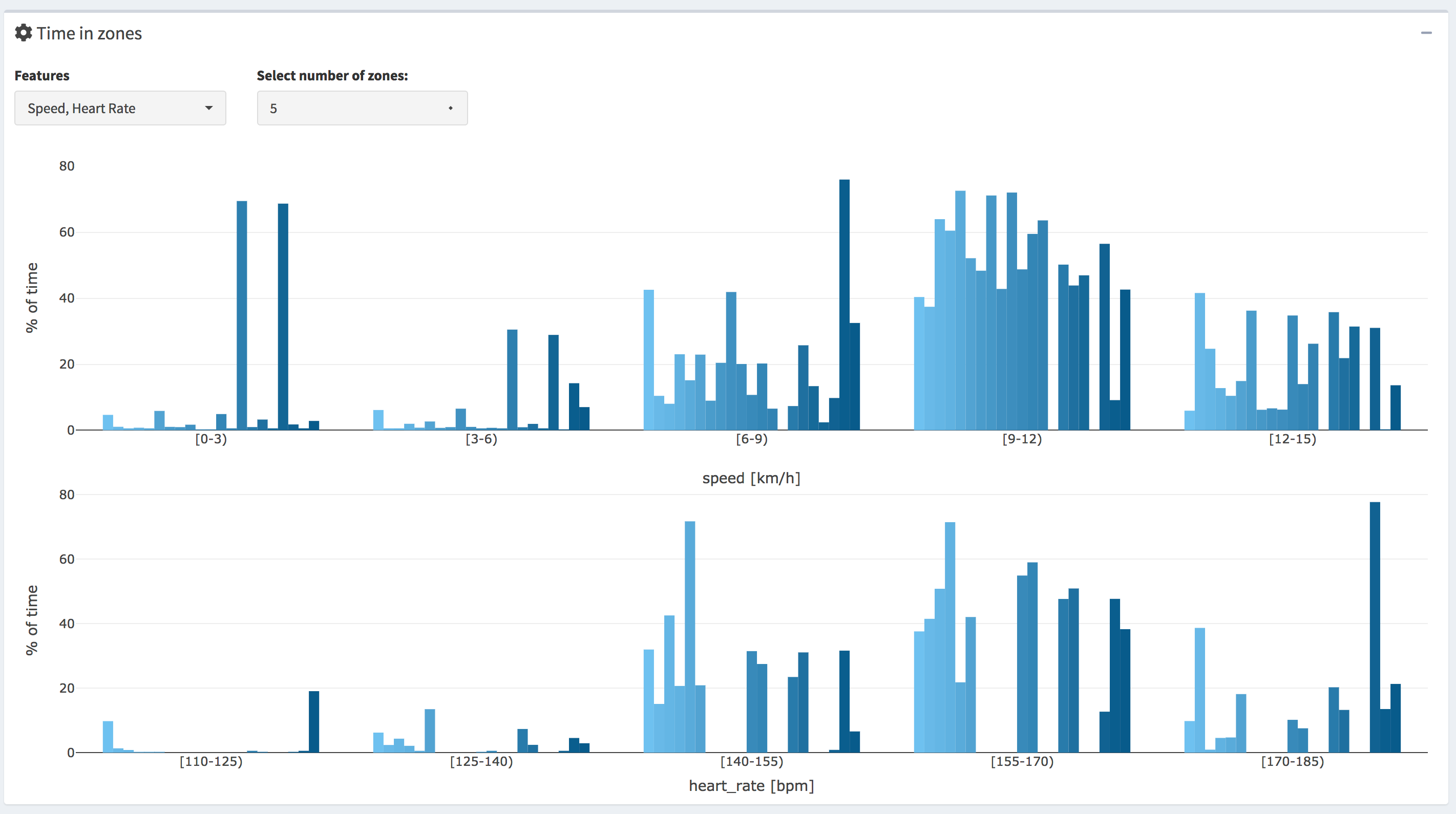
Figure 1.10: Time in zones multiple sessions
1.8 Concentration profiles plots
The concentration profiles (Figure 1.11) are the negative derivative of the distribution profiles, where distribution profiles describe the time spent exercising above a threshold for a selected variable (e.g., m/s or bpm) in a given session, as defined in Kosmidis and Passfield (2015). The x-axis shows the value of the selected variable and the y-axis represents the time differential. The trackeRapp implements concentration profiles plots for the following variables: heart rate, speed, pace, altitude, cadence and power. Similar to time in zones plots, the user can specify sessions to be displayed using the legend and hovering over the lines displays the exact x-axis value.
The concentration profiles can be roughly interpreted as a smoothed version of the time in zones plots. However, the interpretation of the time in zones plots are affected by the number of zones selected and can result in a loss of information and wrong understanding. On the other hand, the concentration profiles are suitable for revealing concentrations of time spent around certain values of a given variable, e.g., heart rate or speed. The shape of the concentrations profile exposes important insights about the user’s sessions. The peaks of the profile reveal the distribution’s modes, which are the concentrations of the most frequent values of the distribution, without being influenced by outliers or skewness of the distribution. For instance, a double-peaked distribution might reveal the concentration of the warm-up and cool-down speeds. The height of the concentration profile provides information on the exact time spent at different values allowing for a clear comparison between sessions. The spread of the profile shows how variable and consistent the values are in the session. For instance, a relatively narrow (small standard deviation) distribution with a distinct peak suggests a very consistent session with highly concentrated values. On the other hand, a relatively wide multimodal (no distinct peak) distribution suggests a session with high fluctuations in values.
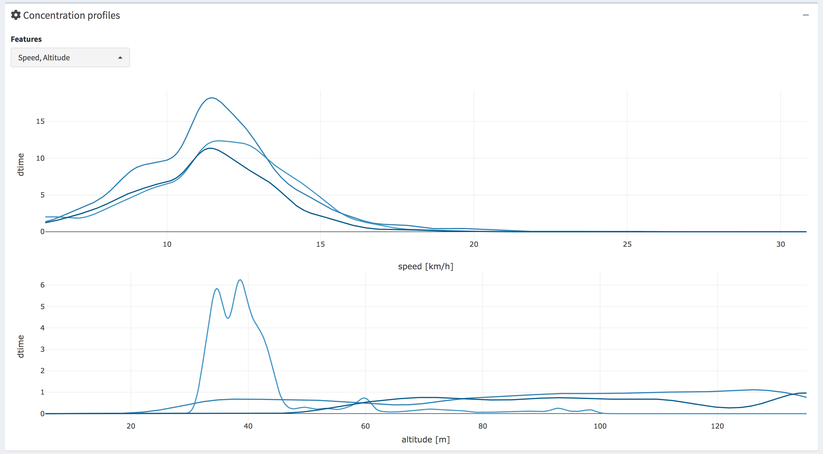
Figure 1.11: Heart rate comparison between Sessions 14 and 10
1.9 Sports identification
Many athletes collect data on various sports, such as swimming, running and cycling. In order to allow the user to analyse the individual sports separately, the trackeRapp splits the users sessions by sport. The trackeRapp lets the user select which sports to display as shown in Figure 1.12, where the user can select any of the sports and the user interface is automatically updated based on the selection.

Figure 1.12: Sport classification
1.10 Changepoint detection within sessions
In order to provide an athlete with insights on their consistency, deterioration or improvement of their performance throughout a session and identify weak or strong segments, the trackeRapp implements a changepoint detection algorithm to detect changes within a session for the following variables: speed, pace, heart rate, cadence running, cadence cycling and power (see example in Figure 1.13). The changepoints are detected in a given plot by clicking the Detect changepoints button in the toolbox circle in the top left corner of each plot and the detected segments in each of the selected sessions are displayed by blue dash lines.
The changepoint detection is implemented separately for all of the variables available in the users dataset. The user is able to select the maximum number of changepoints to search for in a session. This provides the flexibility to limit the number of segments to only detect, for example, the two most important changes in the session. For instance, in Figure 1.13 the maximum number of changepoints is set to 3 changes for speed. However, the algorithm might detect fewer segments than the maximum set by the user due to the penalty measure implemented, in order to avoid over-fitting. By providing the option to set the maximum number of changepoints, the user is able to set a reasonable maximum number after observing the shape of the data.
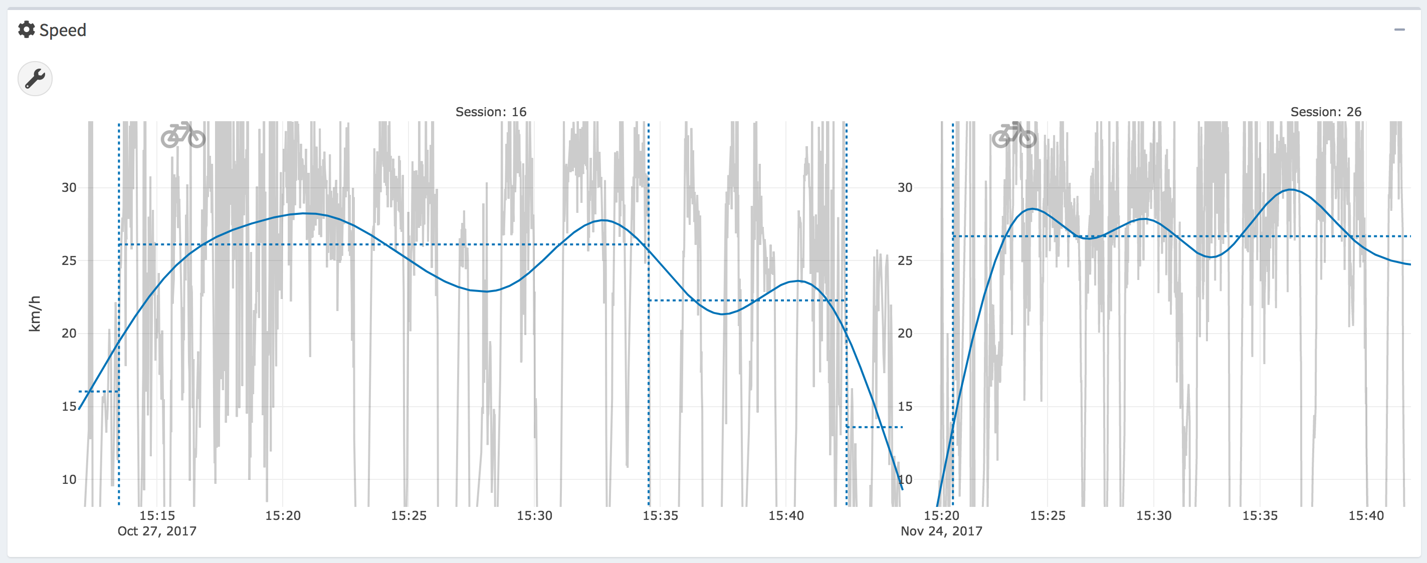
Figure 1.13: Changepoint detection (dark red dash line
References
Frick, Hannah, and Ioannis Kosmidis. 2017. “trackeR: Infrastructure for Running and Cycling Data from Gps-Enabled Tracking Devices in R.” Journal of Statistical Software 82 (7): 1–29. https://doi.org/10.18637/jss.v082.i07.
Kosmidis, Ioannis, and Louis Passfield. 2015. “Linking the Performance of Endurance Runners to Training and Physiological Effects via Multi-Resolution Elastic Net.” arXiv, 1–8. http://kar.kent.ac.uk/55791/.